
Overview
Two Chairs built one of the highest-quality therapy practices in the country and is now focused on expanding access so more people can receive care. With demand far exceeding supply, the biggest opportunity was increasing clinician availability. Beyond hiring, our product team focused on optimizing how clinicians managed their availability—and rebuilding the Client Scheduler was the key project that unlocked this phase of growth.
My role
Led end-to-end design from discovery, research, ideating, design, testing, to implementation.
Collaborators
Cross-functional partnership between Product, Design, Engineering, Data, Clinical leadership, People, and Operations.
Timeline
1 year
2024 launch
Impact
We took on the administrative burden of scheduling so clinicians could stay focused on their clients.
+30%
+31%
-31%
Problem
More than 30% of clinicians were falling short of scheduling expectations, and the issue intensified as the team rapidly grew. Clinicians relied on the Client Scheduler to manage their availability, but the legacy tool wasn’t supporting their needs. We needed clarity on the root causes in order to address the problem effectively.

Solution
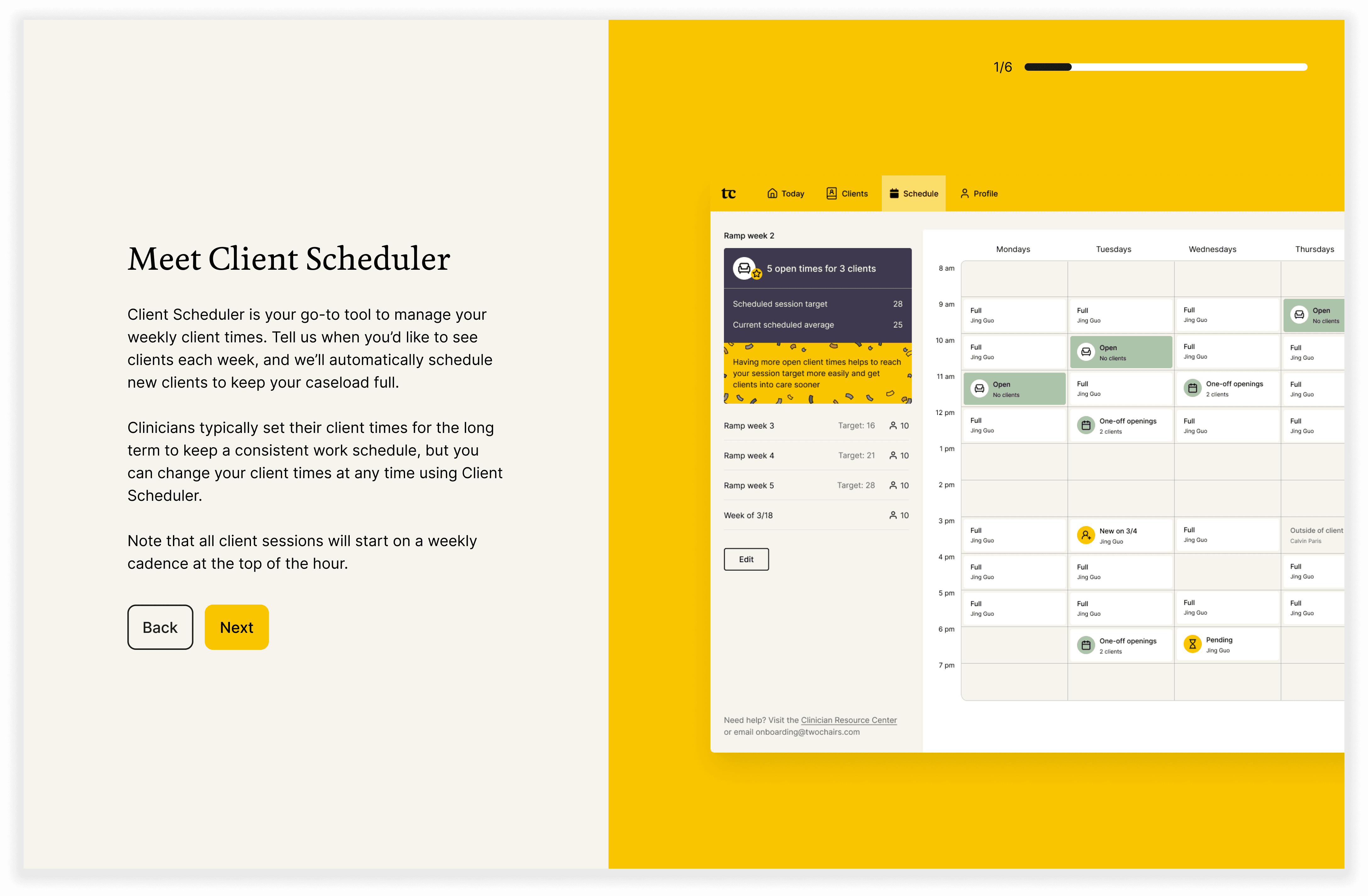
Clear and actionable availability status
Simplified scheduling goal - we worked with the leadership team in changing clinicians' scheduling goal from 64% utilization to 28 weekly scheduled sessions. Making it easy to understand and act on.
Easy to manage single source-of-truth - Client Scheduler is now the only place clinicians can change their long-term recurring availability, giving them complete transparency and control of their client schedules.
Explicit time-slot status - easy-to-understand status for each recurring time slot, and each card is interactive to help provide more contextual details to help clinicians make decisions.

Intuitive editing experience that builds confidence
Actionable insights - As schedules shift, the system notifies clinicians if they have enough availability to meet their goals. We want to make sure they feel confident about the changes taking place after they edit.
Unpopular times guidance - To balance supply and demand, we introduced a policy through the client scheduler that encourages clinicians to limit availability during unpopular times. Isolating this information in edit mode to simplify the UI and give context only when needed.

Self-guided in-app onboarding
A streamlined onboarding flow enables new clinicians to become self-sufficient with minimal support from their managers. Consistent in-app guidance ensures that all clinicians receive the right recommendations for effectively managing their schedules.


Maturing the design system
We took advantage of the complete rebuild to improve our design system for clinician products to be more intuitive and in alignment with our new brand guidelines. We introduced new components with the new availability calendar, and branded visuals to bring delight and consistency to our clinician experience.

Approach
The client scheduler is a critical part of the business, directly tied to revenue generation. Because of its impact, we invested heavily in defining the problem space and aligning on a clear long-term vision.
Break down ambiguity
Discovery workshops
Stakeholder interviews
Clinical capacity is measured by "utilization rate"—a complex business metric that tracks the percentage of clinicians' working time spent with clients. It also serves as a clinician-facing performance measure. Most clinicians don’t fully understand how their actions contribute to the metric. To bridge this gap, we interviewed internal subject matter experts to gain a deep understanding of the factors influencing utilization, allowing us to identify more effective strategies for improvement.

Map the system
Service blueprint
User journeys
When facing a large and ambiguous problem space, one of my first steps is to map the high-level ecosystem—including key user roles and the surrounding systems. This helps ground the work in context and often reveals hidden workflows and pain points that might otherwise go unnoticed.

Leverage user research to prioritize opportunity areas
Usability testing
User Interviews
Focus groups
We conducted user research with high- and low-performing clinicians, as well as managers, to identify behavioral patterns and best practices affecting clinician utilization. By analyzing how clinician capacity flows through our service ecosystem, we mapped user insights along their journeys and developed a prioritized list of high-impact opportunity areas for improvement.

Key Insights
Performance goals need to be actionable
Utilization rate is a business metric that involves many factors beyond their control and it’s not fit as an actionable performance goal.
Manual availability set-up is an efficiency-killer
Without a setup interface, the legacy tool forced Ops to manually collect and upload clinician schedules — an error-prone and unscalable process.
Lack of standardization is a bottleneck for scaling-up
Beyond the performance goal, there was little standardization in scheduling practices — each team and clinician managed schedules differently.
Automate, automate, automate
Client Scheduler functions as an operational workflow. Apart from specifying their weekly availability, clinicians have minimal tasks to complete — the system should automate the rest wherever feasible.
Co-create what success looks like
Vision workshop
Sketching
When tackling a large problem space, I always start the solution phase with a vision exercise involving the cross-functional team. This helps align our collective understanding of the key problems to solve for and what success looks like, fostering confidence and clarity as we move forward with the design work.

Finding direction by testing early
Wireframes
User testing
We began guerrilla testing with clinicians in the earliest stages of design, when concepts were still in low fidelity. With several major conceptual changes happening beyond the tool itself, early and frequent testing was essential to ensure alignment and usability.

Start with the most complex user role and scale down
UX/UI design
Interaction design
Full-time clinicians working 40 hours a week faced the greatest challenges in managing their availability, balancing company and team responsibilities alongside client care. To address this, we focused our initial designs on their needs, then scaled the solution to support other clinical roles.
Brand alignment
Visual design
At the final stage of the project, the brand team introduced our new visual language and guidelines. I embraced our refreshed brand essence and integrated it into the Care Platform, enhancing the clinician experience with moments of delight and consistency across Two Chair products.


Product Strategist
Researcher
Designer